Seizing the spotlight.
Bikepark Winterberg | Brand Boost
Despite being one of Germany’s longest running (and most nostalgic!) bikeparks, Winterberg faced a huge challenge – being outstripped by younger competitors. How to get back on track? Total brand re-launch.
| SERVICES | Research Brand Communication Performance Marketing |
Winterberg, who?
Bikepark Winterberg is one of Germany’s classic bikeparks. With over 20km of trails, this classic park served as the first run for many professional athletes and holds a special place in their hearts. Located perfectly to capture all northern riders hungering for a taste of the mountains, Winterberg was one of the most popular destinations for thrill-seekers. But all that has changed…
No-one is immune to challenge.
In the last few years, Winterberg has faced an ongoing issue. An increasingly outdated look. No longer number one, the bikepark has fallen behind the times regarding its design and brand language. With local competitors springing up offering more modern experiences, Winterberg risked falling out of favour with riders. The solution? A bold re-brand.
Impact. Generated fast. Explore the brand re-launch for MAGURA.
Goodbye Winterberg.
On the 7th of April, the Bikepark Winterberg website shut down. “Winterberg says goodbye” was the sole epitaph, marking the end of an era. But just as the buzz was starting to die away, we overhauled the brand in full force. Our strategists perfectly positioned the bikepark to stand out against the competitor climate and our communication experts turned these insights into a strong, new corporate design.

Hello “The Mother”.
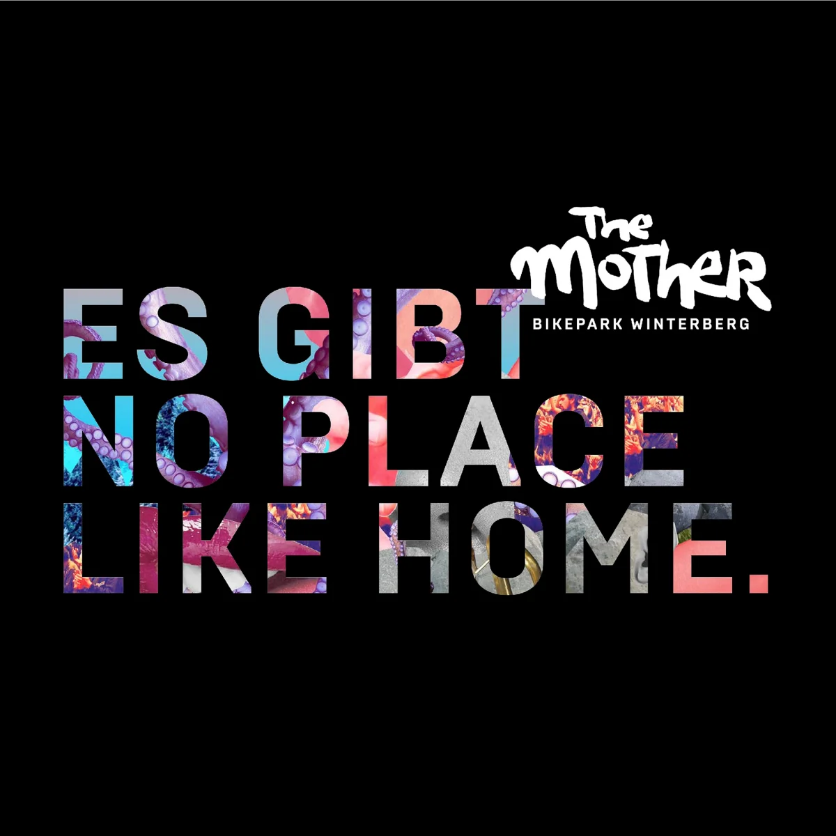
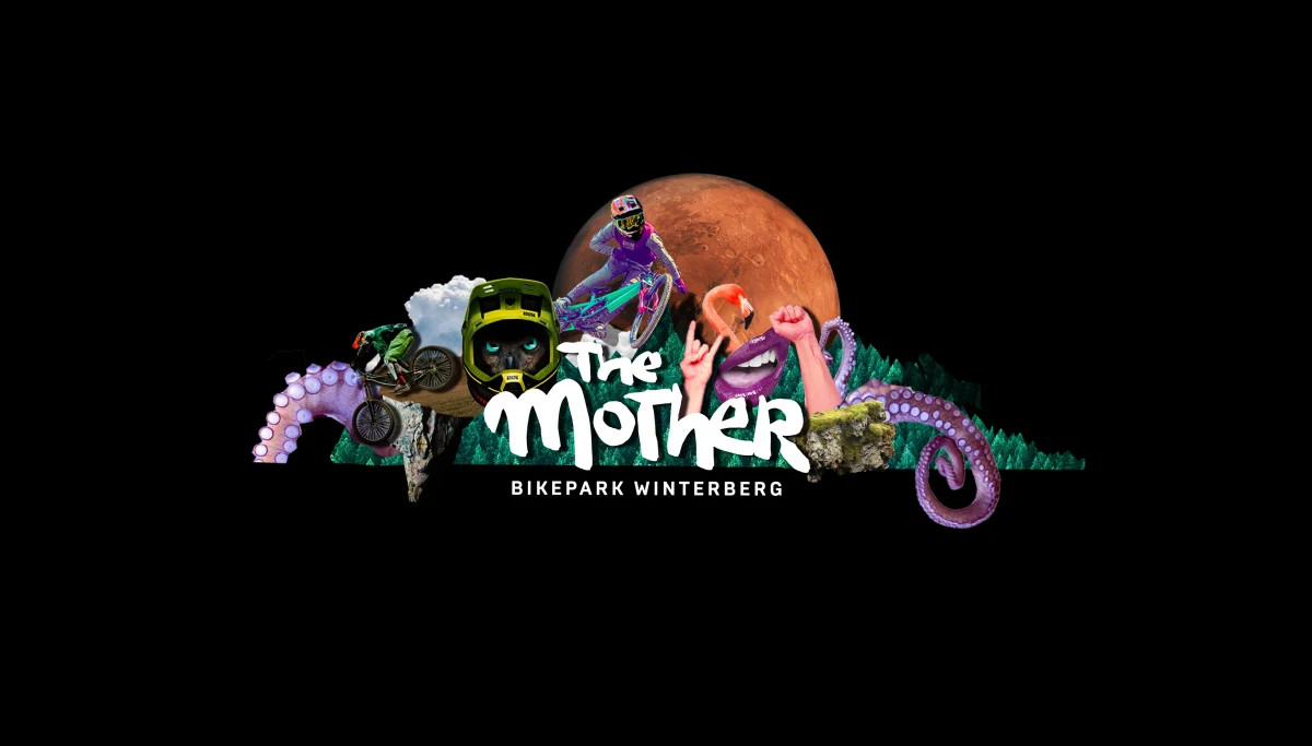
The Mother is the place that everyone can call home. And, just like home, nothing else can compare. Here, you’re accepted. Here, you’re welcomed with open arms. And here, The Mother is your family. We used this unique angle as the branding inspiration, and it has fuelled every strategic decision in the definition of a new logo, claim, typography, and colour code.
Welcome home!
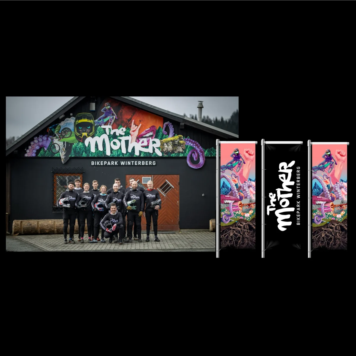
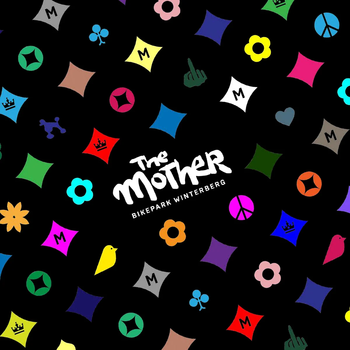
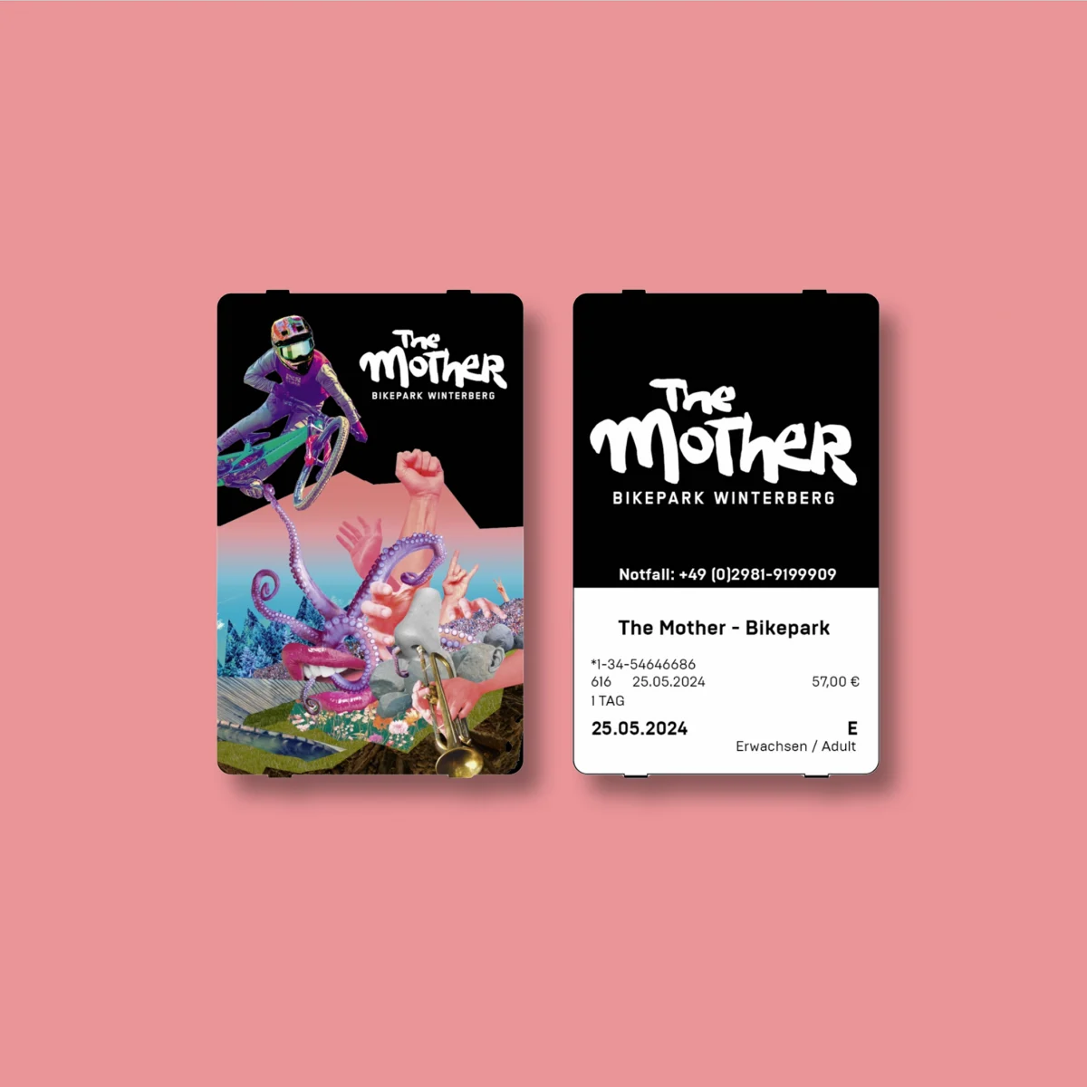
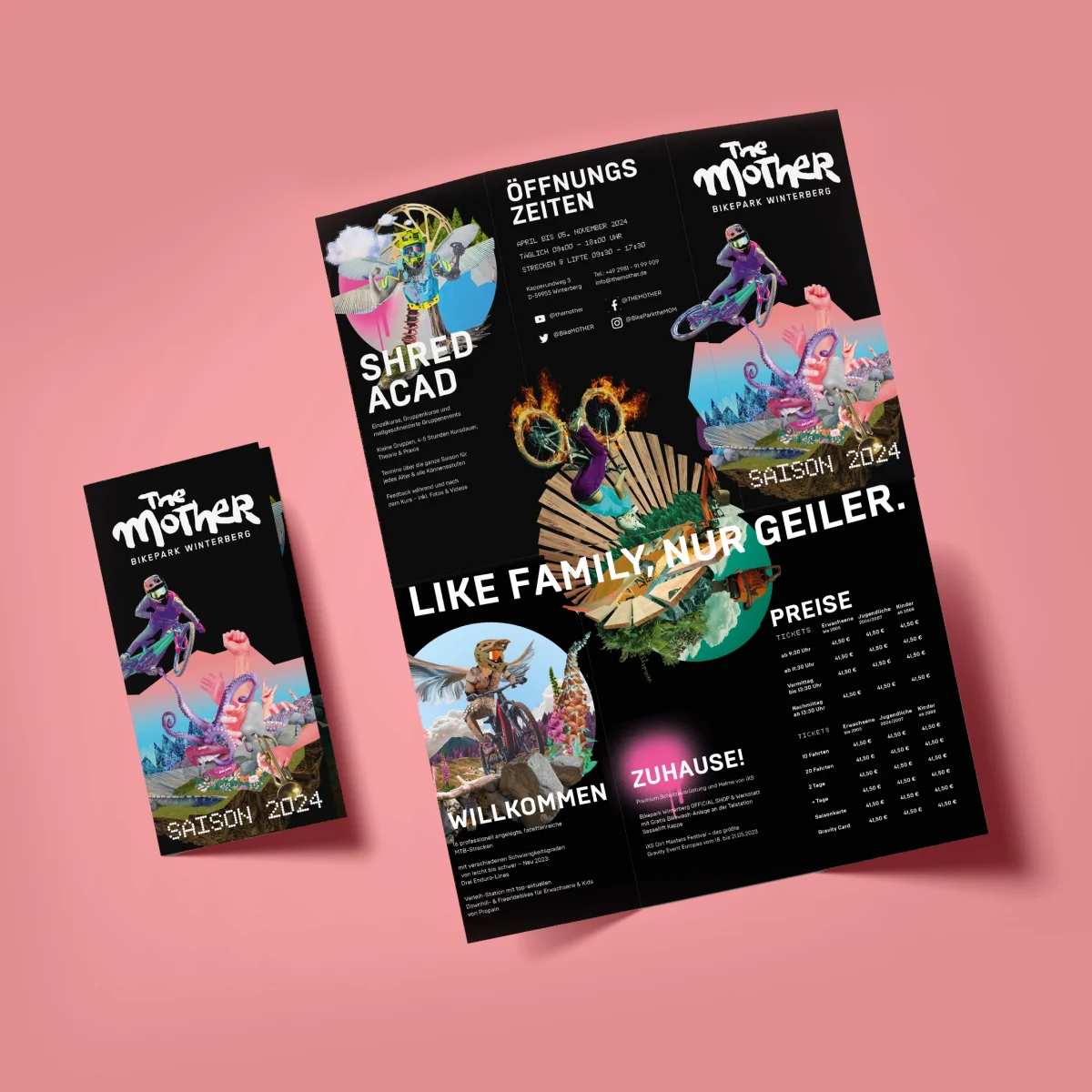
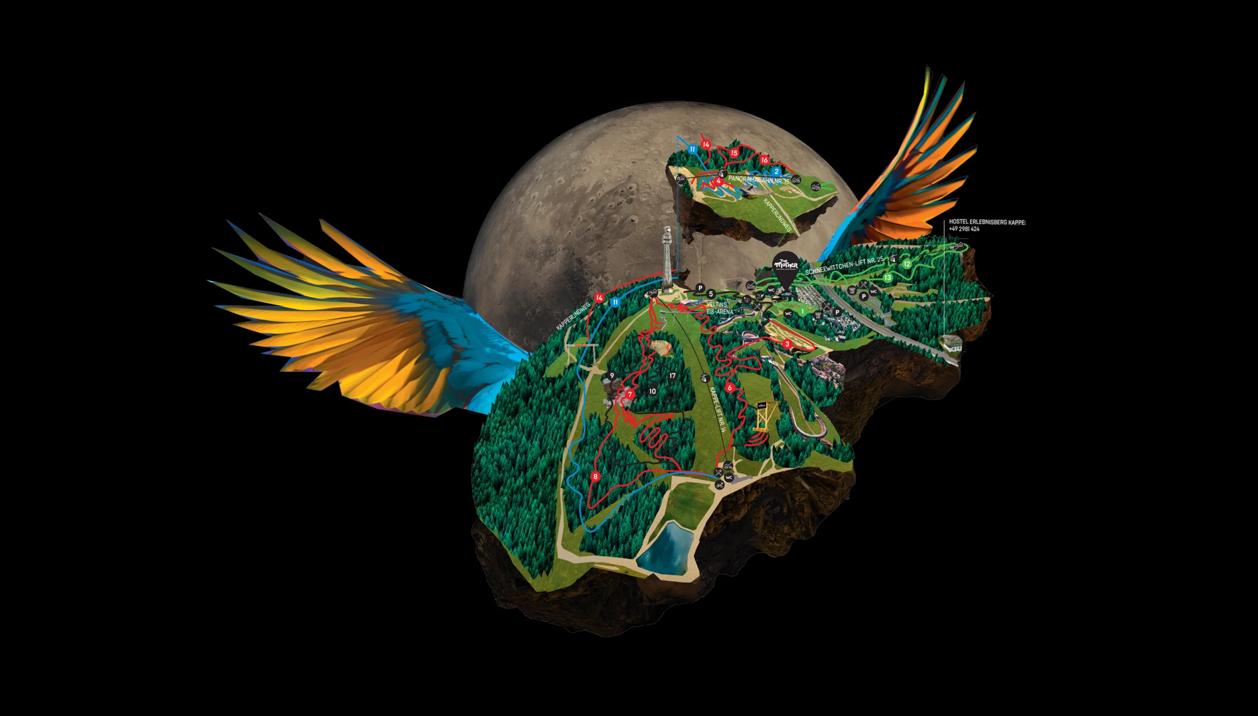
We created a whole universe of branding. Completely fantastical, surreal graphics communicate the feelings of freedom and fun you discover at the bikepark. The logo transformed from a dated, corporate item into an organic, handwritten (human!) element. It’s unique, like a band logo, and perfectly communicates an imperfect nature. Made for misfits. On top of the logo, we created wild helmet designs, crazy signage, whimsical posters, unique t-shirts, quirky adverts, and a whole new website.
A dream made real.
The Mother made its grand re-debut on Mother’s Day (of course!). The visual identity we had carefully crafted was transformed into physical assets. From the bike station to the park maps, The Mother team has been at ‘full send’ to get the site shaped up. Bright new murals and bold patterns give life to every surface, shed, or wall. And, of course, the lines and trails had been revamped to match.
The key takeaway.
As a brand, your most unique asset is what makes you irreplaceable. The Mother knew this, and now stands tall against a flooded competition field. With a clear visual language which is present in all their touchpoints, The Mother can make an emotional connection with its users from the trail map to merchandise. Find what makes you special. Then find a way to utilise it.
German Design Award 2025 winner!
THE MOTHER, formerly Bikepark Winterberg, wins a GDA for Excellent Communication Design.
Check out more of our work.
Sharp thinking. Bold execution. KISKA generates brand experiences with business value. From strategic consulting to hands-on execution of your vision. See the results for yourself.
