Brand revival. Ripe for acquisition.
WECK | Brand Boost
A beloved brand came to KISKA with a familiar challenge. How to get future-fit? Using strategic guidance from our research team, we identified opportunities for refinement – resulting in rapid turnaround and financial acquisition in 2024.
| SERVICES | Brand Communication Research Brand Strategy Product Consulting Innovation Consulting Branded Space Design |
Everyone knows it. Everyone loves it.
WECK is a household name here in Austria. This German company was founded at the beginning of last century and introduced the ‘home-canning’ method using glass jars. No matter who you are, WECK jars are likely found within your home.

But they were not immune to challenge…
User behaviours were changing. In 2023, after a period of financial challenges, WECK was acquired by AURELIUS. They recognised the need for a refresh to excite their uses – both new and established. Our research and communication teams united forces to reposition WECK to be future-fit.
B2B & B2C impact.
The first step was to examine the brand as it was. What does WECK stand for? How is the brand perceived? How is it positioned in the market? Our results were overwhelming. As a B2C brand, WECK has a strong, loyal consumer base who associated the brand with lovingly made food, high-quality durability, and family values.

Into the world of WECK.
We translated the implications of the research into actionable points for WECK. The output would serve as a decision template to rapidly deploy the brand, to both established consumers and new markets. We solidified all this research into a strong, future-proof goal for the brand: to bring as many high-quality products to as many channels as possible in the next few years.
Impressed by our brand strategy team? Get into their headspace here.

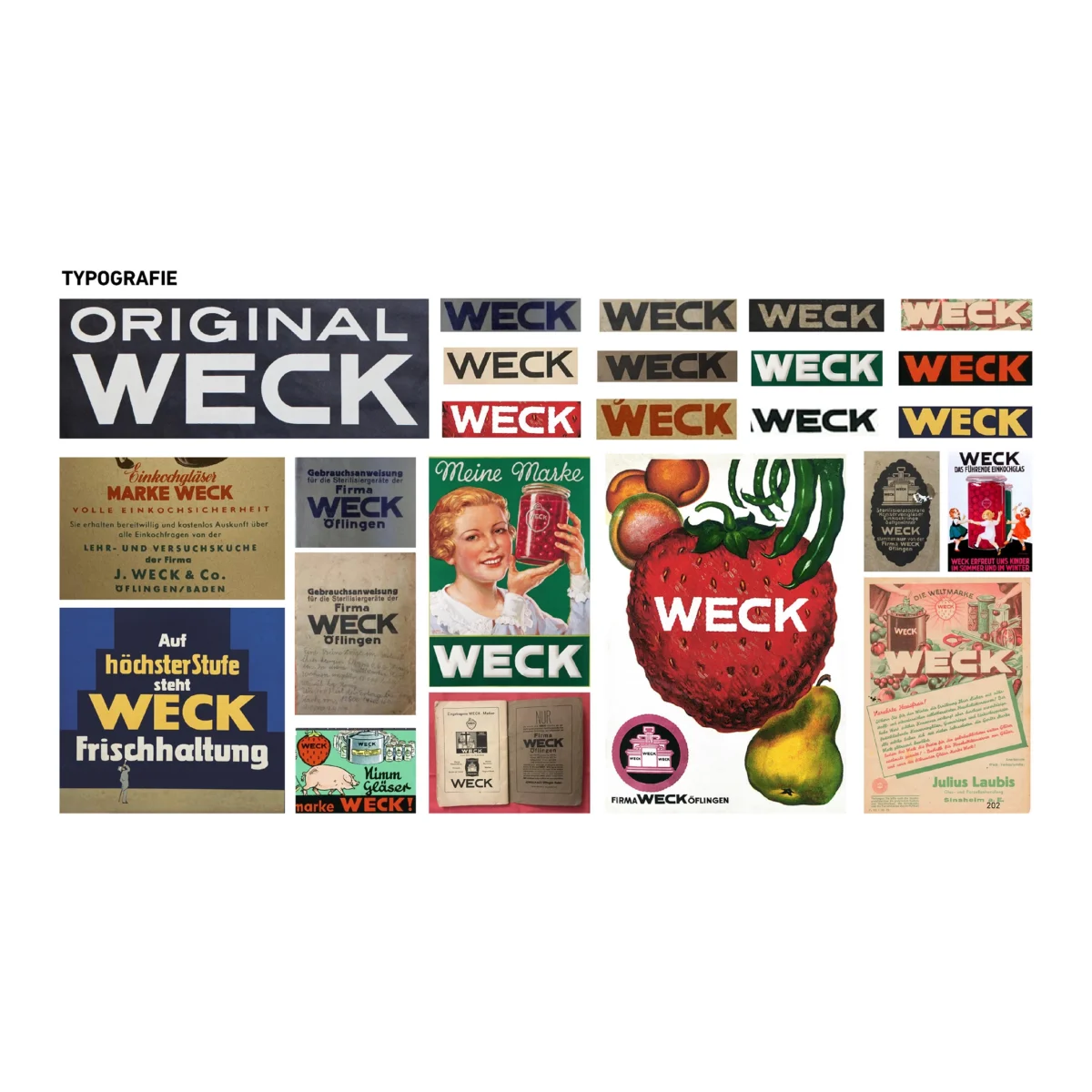
Branding from the core.
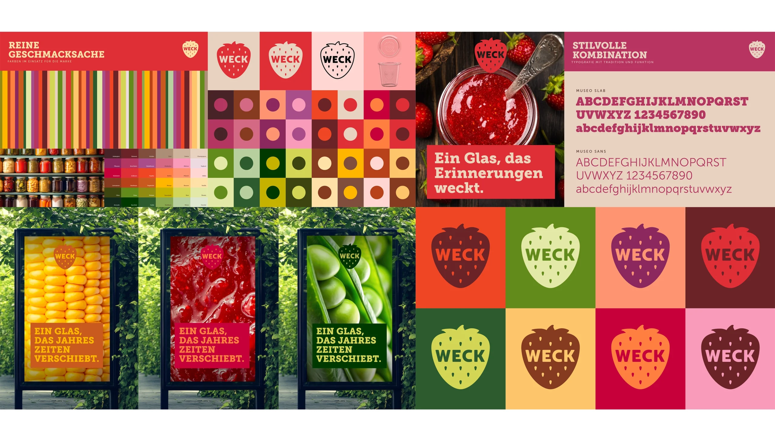
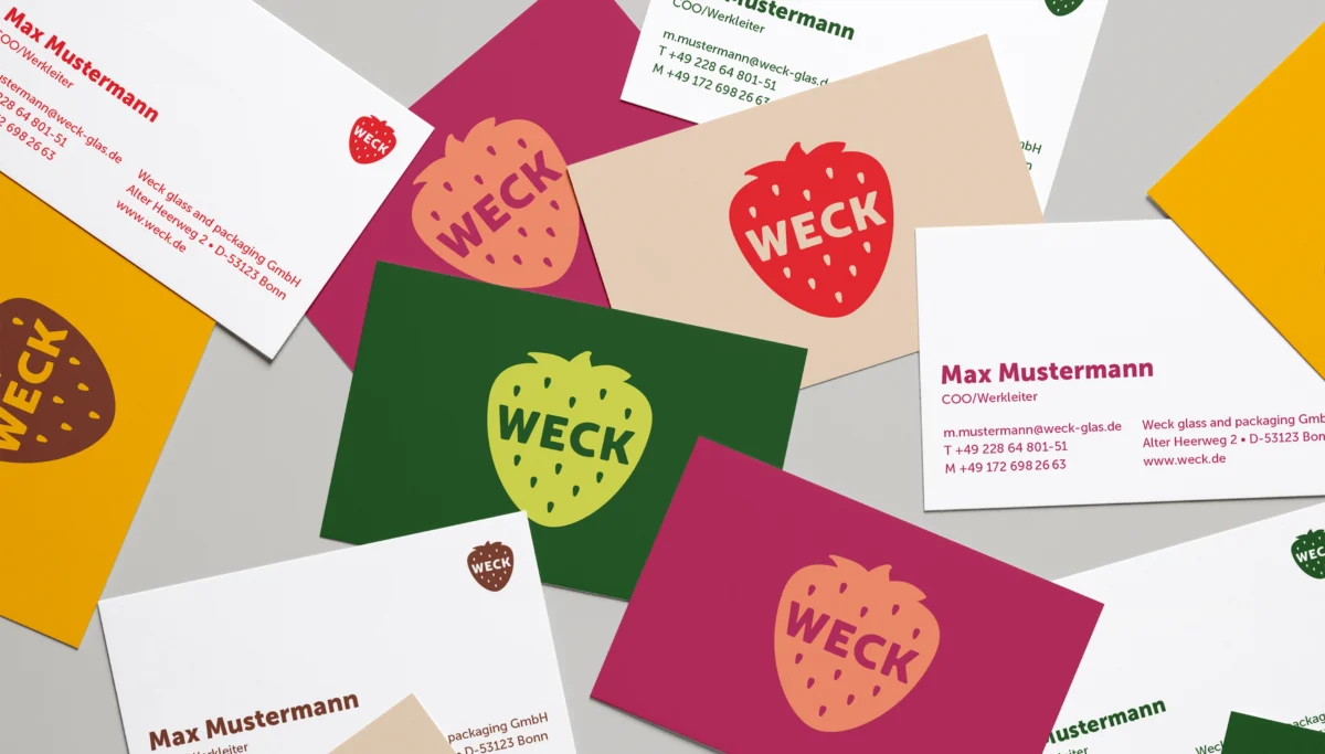
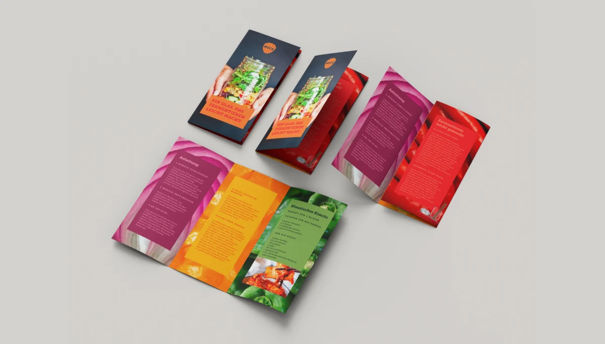
Building on this research, our communication experts got busy. We defined new colour palettes and created a logo update, carefully modernizing their existing strawberry icon. The new picture style is clean and authentic: real food, real smiles, and real emotion. But at the centre of the brand? The product. Always.
Jars, cars, handlebars, and more. Check out our other work.

One message. One brand.
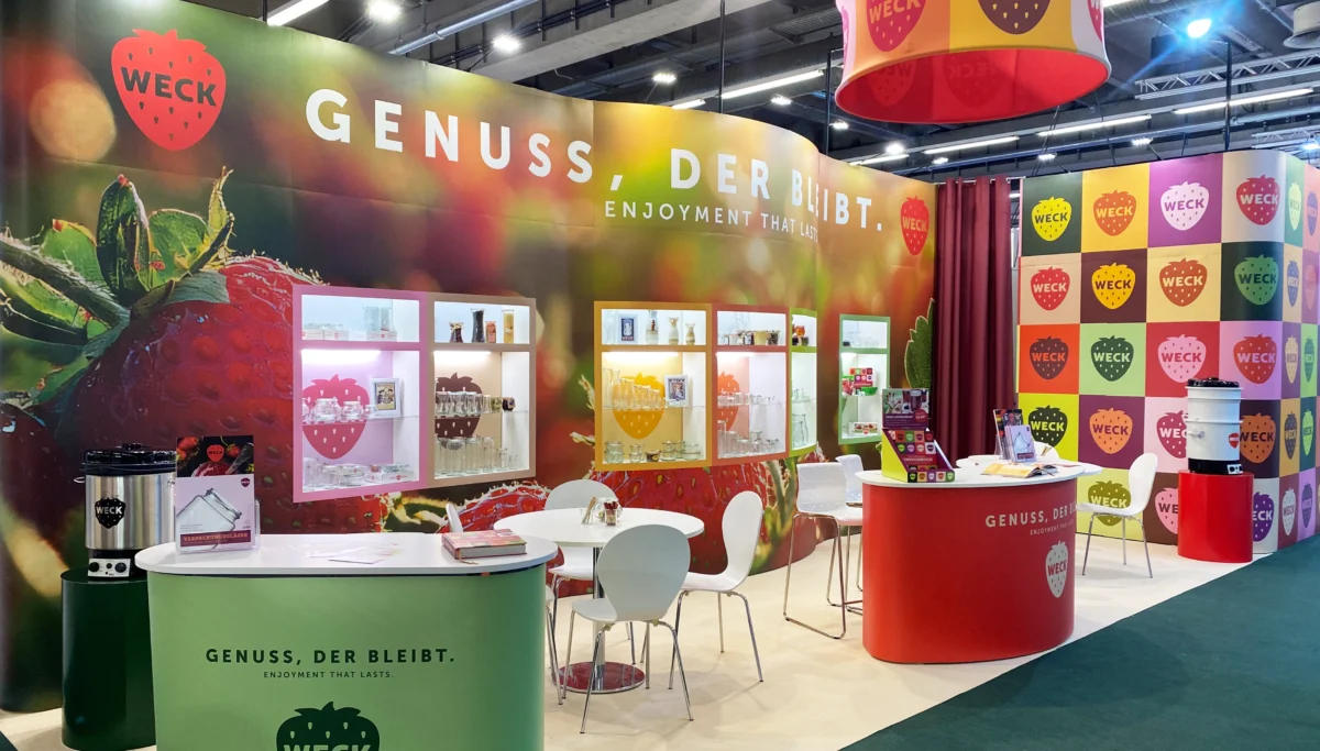
We drew up a new brand promise for WECK, based on the user personas created from our research. The promise: ‘Genuss der bleibt’ or ‘Pleasure that lasts’, references the preservation of food and the delight which comes alongside it. This enjoyment – this passion – is a story only WECK can tell. And serves as their new brand claim.
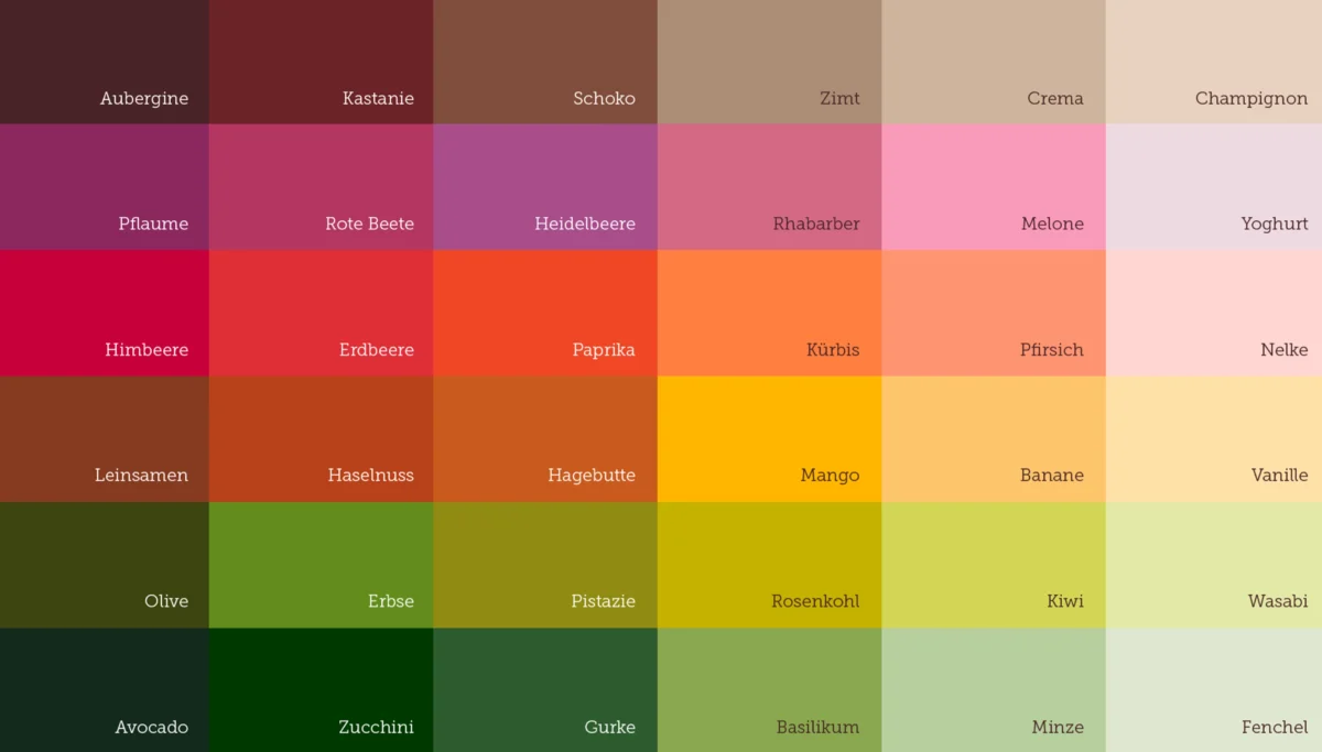
Tasty tones.
The new WECK colours should look good enough to eat. We’ve used organic palettes with shades such as pumpkin, eggplant, apricot, and mushroom to evoke that ‘food feel’. Our logic? The brand colours shouldn’t just be bright, they should be used purposefully and tastefully for maximum deliciousness.
Jump into another heritage brand refresh. Meet ‘The Mother’!

Drawing on WECK’s strengths.
The history of WECK is one of their most powerful assets. Our experts respected this heritage by choosing fonts which blend tradition and modernity seamlessly, as well as keeping the iconic strawberry logo. The new brand values touch on community, sustainability, and timeless authenticity.

Strong foundations.
Our knowledge and understanding of the future, combined with our creative prowess , empowered WECK to make thoughtful changes which resonate with the end user. Today’s customers know that when they choose WECK, they choose top quality. Now and forever.
Check out our headspace.
So many cool things. So little time. We have a lot more on our minds: prototypes, opinions, processes, and events. Get your fill of the good stuff. Get into the Exchange.
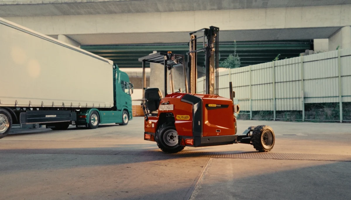
Shifting perspectives for growth in the EU.
Lightweight, compact, and tough: that was the goal. We took the best from our American PALFINGER TMF design – like its efficiency and robustness – and gave it a twist for the European market.
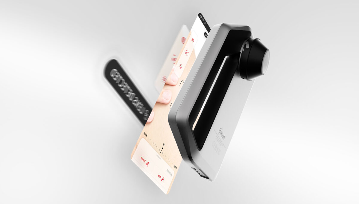
Award-winning AI-powered diagnostic tool
The FotoFinder skeen takes the diagnosis workflow and streamlines it for the modern practitioner. Rapid visualisation, secure storage of data, and accurate capture of patient’s dermoscopic images empowers doctors to elevate their diagnosis procedure.
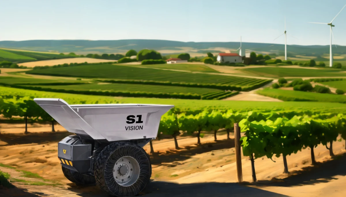
Creating an investment-worthy concept video | Liebherr S1 VISION
Liebherr’s S1 VISION was a game-changing autonomous hauler. But, they faced a challenge – going from abstract concept to trustworthy investment potential.